


After a couple days of essay length posts, today, I want to briefly talk about the basic placement of shapes in design. The simple use of patterns and shapes, and how they, as the most basic ingredient in art and design serve as the foundation of any layout.
The reason I want to go over such a basic concept is because of a series of videos I watched with my daughters. They love Pokémon and they had a relaxed YouTube channel playing. I always enjoy it when they have a low-key channel playing. No screaming teenage boys or cruel pranks by Minecraft characters playing out in ridiculous scenarios.
Master of Clay
These videos had serene music playing while hands molded clay into various Pokémon. What caught my eye was how he formed balls of aluminum into circles of all sizes and gradually shaped them and pieced them together. What was simple became a complex connection of spheres. Chipping away and reforming until the primer and paint was brushed and sprayed. To artists trained and familiar with the connection of circles to basically any form, or anyone that’s ever read a little bit about how to draw, my focus on these intro level concepts may seem silly. Maybe it was just my headspace, but I was fascinated by how it all went together.
Like each step in the creation of Pokémon sculptures, the geometric aesthetic of graphic and web design hinges on the use of basic shapes and patterns to create distinct visual identities. This approach is not only about the superficial use of squares, triangles, and circles. It’s about balance, symmetry, and consistency. If done right, it can be explained in a brand’s methods and message. It’s the understanding of the basic that usually separates masters of a craft from beginners. So, I see nothing wrong with my fascination.
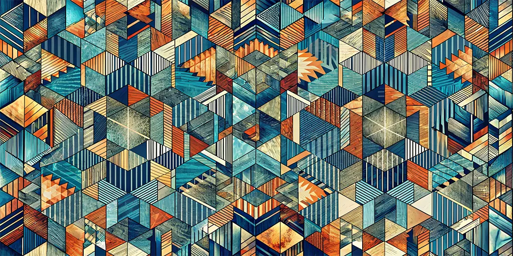
Simplicity of Shapes
Geometric design is really about simplicity. Geometric shapes are the building blocks of visual communication. Everywhere we look are shapes and the patterns they form. Shapes become symbols, become thought, become language. It’s an instinctual recognition on many levels. Millions of years of evolution and stimulated response has led us to understand that it’s not often that straight lines and 90º angles are found in nature. The recognition of a pattern of layered circles and semi-circles has been equally important to our species.
When used in the right ways, the basic shape can create a sense of order and clarity. In design, shapes guide desired actions and planned decisions. And, also, how we view and are guided through any given layout. There are often invisible guides that our brain recognizes that connect spacing and combinations of simple shapes. Like color, the way these figures are placed on a webpage can help direct a desired outcome and the motion of the eye.
The size and scale of these shapes also play a role. Oversized circles become focal points, that draw attention to important content. Conversely, a background pattern of tiny triangles might subtly reinforce personality in the design.
A circle as a focal point with its endless loop can bring a sense of community. An infinite hug. Something that’s inviting and calming. It’s perfect for a logo symbolizing inclusiveness or to be incorporated into the design of social media platform. Squares, on the other hand, project stability and reliability, ideal for a financial institution. Even triangles, with their natural orientation, can be used as a guide towards a call to action/desired action. This is the concept that I mentioned earlier. Invisible lines that direct the eyes through a design. Subtle patterns that are recognizable on a near subconscious level.
Patterns
Patterns, in the context of web design are the repetition and arrangement of geometric shapes. They serve as the backdrop that give layout energy. Depending on their configuration and in combination with color, they bring either energy or calm. They can be bold or subtle, but always contribute to the overall narrative being shared with the user. These patterns can establish a texture that adds depth to their experience. Patterns make interaction with a website more tactile. Really, anything on a screen can become more tangible through proper layering.
In web design, where first impressions are extremely important, the geometric aesthetic is a toolbox. Use of the tools to craft effective sites is what usually separates a master from a novice. Even with a handful of no code, drag and drop builders, it’s still a deep understanding of how shapes can be placed and patterned that proves a designer’s worth. It truly is a language of precision. It can elevate a site from only functional to compelling.
The next time you browse the web, take a moment to appreciate the placement of subtle shapes. It takes time and patience to craft something that tells a story. Iterations of what may seem simple are really years of experience. Thousands of hours of learning to know where to strike the hammer. You might be surprised by how much experience is conveyed through these geometric foundations. They tell you a lot about a layout, and the designer behind it, before you’ve read a single word.