


Today I want to go over some information I wish I would have known earlier. Designing a good landing page seems like it shouldn’t be that difficult, but it does have some nuance that I didn’t quite grasp when I first started out. As I have learned over the years, everything about sales is psychology. It’s not about cheap attempts to trick potential customers into buying what you’re selling. It’s about confidence and calm communication. A landing page is no different. You’re communicating a short story to convert. Succinct confidence is a great friend.
Basics of a Landing Page
Your landing page is a conversation, not a static billboard. Landing pages are a digital storefront for your marketing campaigns. Their main purpose is to guide visitors toward one specific action, be it signing up for a newsletter, registering for a webinar, or making a purchase. The effectiveness of a landing page is measured by the percentage of visitors who take the desired action or conversion rate. To design a landing page that converts, certain elements must be carefully considered and placed properly for your desired results.
Minimalism
Landing pages thrive on minimalism. Avoid cluttering your design with unnecessary elements like navigation bars or social media links. These can distract visitors from your core message and the conversion action you desire.
Strip away those distractions. You have an action that you desire your users to follow through on. It should be easy. A navigation bar might tempt them to explore other parts of your website, breaking their focus on the conversion goal. Social media links can be saved for after they’ve converted.
Clarity
Clarity is the magic of a good landing page. The message must be immediately clear to the visitor. It must have a compelling headline that captures attention and succinctly conveys the value proposition. It should be supported by a sub headline that offers a brief explanation of the offer or service. Together, these elements should align with the visitor’s expectations based on the ad or link they clicked to get there, creating a smooth transition.
People like predictability and you should use this, to an extent. I’m not saying make something bland. Just keep it clear and simple. You don’t have to play tricks to sell your product. Be upfront. Ask what you’re going to ask.
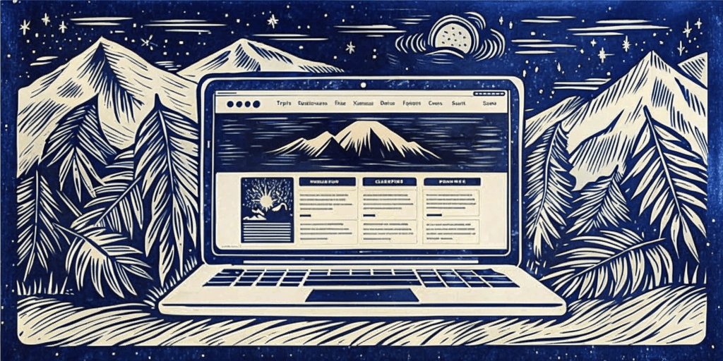
Landing Page Design
Visuals play a crucial role in engagement. High-quality images or videos that illustrate the product or service can increase the visitor’s understanding and interest. These visuals should be relevant and help to tell the story of the brand or the benefits of the offer. They must be strategically placed to draw the eye without distracting from the main message.
Color
Again, the use of color and whitespace should not be underestimated. As I’ve gone over several times now, proper use of color can evoke emotions and highlight important elements in the visual hierarchy like the call-to-action (CTA) button, while whitespace helps to avoid a cluttered look and focuses the visitor’s attention on the most important parts of the page. Relax your potential customer. Invite them to have the conversation you’re trying to have. Don’t force it onto them. That’s frustrating and drives people away. So, use color but don’t overdo it. It seems desperate and that is a huge turn off.
Call to Action
The CTA is the centerpiece of the landing page. It must stand out and it should feature persuasive text that encourages the visitor to take action. The CTA must be visible without scrolling, also known as being ‘above the fold’. This ensures that every visitor sees it, regardless of their device.
Trust
Trust signals are another vital component. These can include testimonials, reviews, client logos, or security badges. They serve to reassure visitors of the credibility and safety of the offer. It further relaxes users. Social proof, like testimonials, can be particularly persuasive, as people often look to the experiences of others when making decisions.
Think of all the times you’ve looked at reviews. You can tell when it’s fake. Sincerity, and authenticity are best. In my opinion anything else is scummy. If you trust your product you shouldn’t have to fake it. Have some ethics. It’s more important to keep people coming back with sincerity and honesty than making as seen on tv like promises that break under scrutiny or light use.
Performance
Loading time is also a critical factor. A page that loads slowly can frustrate visitors and lead to them leaving before they’ve even seen the offer. Optimizing images, minimizing code, and using fast hosting services can help keep loading times short.
The overall layout must be intuitive. Visitors should be able to navigate the page easily and find information without confusion. A logical flow from the headline to the visuals, benefits, and finally to the CTA can guide the visitor naturally towards conversion. Use the rules of visual hierarchy!
A/B Testing
The best landing pages are never finished. Use A/B testing to compare different versions of your page elements, like headlines, visuals, and CTAs. Track which variations resonate most with your audience and continuously refine your design for better conversions.
Don’t rely on guesswork. A/B testing allows you to experiment with different approaches and see what resonates best with your target audience. Test different headlines, button colors, and even the overall layout of your landing page. The data will tell you which variations convert at a higher rate, allowing you to optimize your page for maximum effectiveness. So, don’t be afraid to change something if it isn’t working.
I couldn’t go through all of this without mentioning responsive design… again. Test across device types and screen sizes. Makes sure your landing page is accessible to anyone at any time.
This is just a brief guide, but it really does sum up the process of designing an engaging landing page. As you can see, it requires a blend of psychology, design principles, and technical considerations. By focusing on clarity, visuals, hierarchy, color and whitespace, the CTA, trust signals, loading time, and intuitive layout, you can create a landing page that not only captures attention but also converts visitors into leads or customers.
Be honest and try not to emulate spam. Tricking people into buying your product is lame. The goal is to make the visitor’s journey from interest to action as compelling as possible with trust, good design, and ease of use. A high-performing landing page is a conversation starter, not a monologue.