

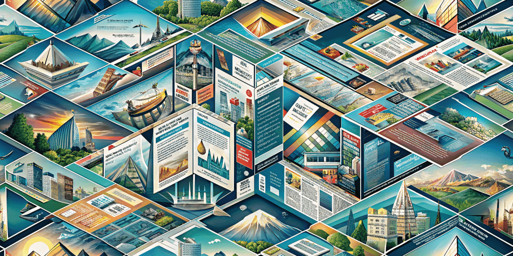
Layout is the simple act of arranging elements on a page. In magazines, well-designed layouts entice us to read more deeply into an article, while the layout of a website can determine how quickly information is found. Understanding the principles behind layout, whether for print or web, unlocks a powerful tool for visual communication.
The web is layout in motion but isn’t much different from a magazine or newspaper layout. It’s still an interaction of shapes and information fit into a space. As a child I wondered how all the information was placed. Later on, when the internet came in the mail as promotional AOL discs, I became equally as fascinated with how the information appeared on the screen.
I spent a lot of time flipping through libraries of old National Geographics my grandparents had collected over the years. At one point my family inherited that collection that spanned several decades. Having an interest in journalism and publishing, this gave me a chance to see how page layouts changed over time, and also how advertising fit in and evolved over the years. This led me to my interest in web design.
How Layout Fits
I found myself wondering how it all fit together. How did the text seem to fit so perfectly? It all made me so curious. The shapes interacted with the text like puzzle pieces. Did they write to fit the space or did some unseen hand design around the words?
Fast forward to the recent past/today, layout has taken on a new dimension. How we consume information has changed. For all the discussion about print being a dying medium, it hasn’t disappeared. Depending on your perspective, print can be a static reminder of impermanence. Likewise, websites are no longer static pages. Websites are interactive landscapes. They’re designs are supposed to be responsive. Responsive and legible across a multitude of different screen sizes. Effective website layouts anticipate user behavior. Navigation bars are strategically placed for easy access. While calls to action stand out with clear visuals and contrasting colors.
Unlike magazines, websites often incorporate negative space strategically. The space is more valuable in print. Although negative space is utilized, every piece of real estate on the page is valuable.
Responsive Design
In a bit of a contrast Responsive design, a core tenet of modern web layout, ensures that a website adapts seamlessly to desktops, tablets, and mobile phones, providing an optimal experience regardless of the device. While any visual space has some value, the negative space on a website isn’t nearly as valuable. It’s an experiment. But, it’s used much more freely from screen to screen. In previous articles, I’ve talked about this as well as how certain parts of your design can direct users’ attitude towards your work.
Web design has its own parlance that is sometimes in contrast to but often holds more similarities than not with magazine layouts. I mentioned earlier, the world of publishing intermingles with the foundational aspects of web design. Interaction is the obvious difference. The web is built on the same formula and the same basic principles as a paper magazine or periodical. It’s still just shapes. Using the rules and principles like the rule of thirds goes a long way to bring life to those shapes.
When it’s all boiled down, the main difference between print and the web is the screen and the responsive design I mentioned earlier. Not normally required in print, there are definitely levels of complexity on the web. The shapes have to contort to screen sizes. Graphics have to shrink and grow automatically on the fly. All the blocks of texts must maintain their consistency when viewed in landscape on a phone or on a 4K monitor.
Web layouts must adapt. Responsive design ensures your website looks great on any screen size. Media queries, flexible grids (hello, Flexbox!), and CSS Grid Layout are your allies here.
Static vs. Dynamic Layouts
What use to be static is now interactive and requires micro interactions and responsiveness to the tools used to view and interact with any given medium. Today, layout is a fluid dynamic in any digital experience. Layout must engage with users as a moving, colorful, pleasurable thing. Something that didn’t necessarily exist as a prevalent diction of design considerations in the past are now the first place to start when designing for the conveyance of information.
How things are read is just as important as when and where they’re read. User mood is always a guiding principle. My prevailing point is that despite the differences in a medium, with a focus on color and layout decisions, we’re able to build UX and engagement on the internet and these mediums aren’t all that different. The rigidity of static templates may be familiar to some but may lack the gratification of interaction that many others have grown accustomed to. We live in the age of statistically predicted and curated interaction. Although the shapes may fit together and now must interact in ways only imagined in the days of hand adjusted layouts, the visual rules are relatively similar.
Interaction and Transition
I’ll leave it to you to decide if this is a good or bad thing. What I do know, and support is the idea that despite many purported truisms, we live in an era of transition. The nature of the digital world, in spite of the guarantee that the internet is forever, feels as ephemeral as ever. That said, what is a guarantee is that design is still an art. This is true, even in the commercial realm. A market where interactions are calculated to the pixel and where impersonal engagement can often dictate how a user is seen to feel about any particular brand.
Whether in print or on a screen, layout serves a critical purpose. It establishes visual hierarchy, guides the user’s eye, and ultimately enhances the message being conveyed. By understanding the principles of layout, designers are empowered to create experiences that are not only aesthetically pleasing but also clear, functional, and engaging. From the carefully curated pages of a magazine to the world of web design, layout remains a powerful tool for shaping how we interact with information.